'The advent of a world class economy' (2009)
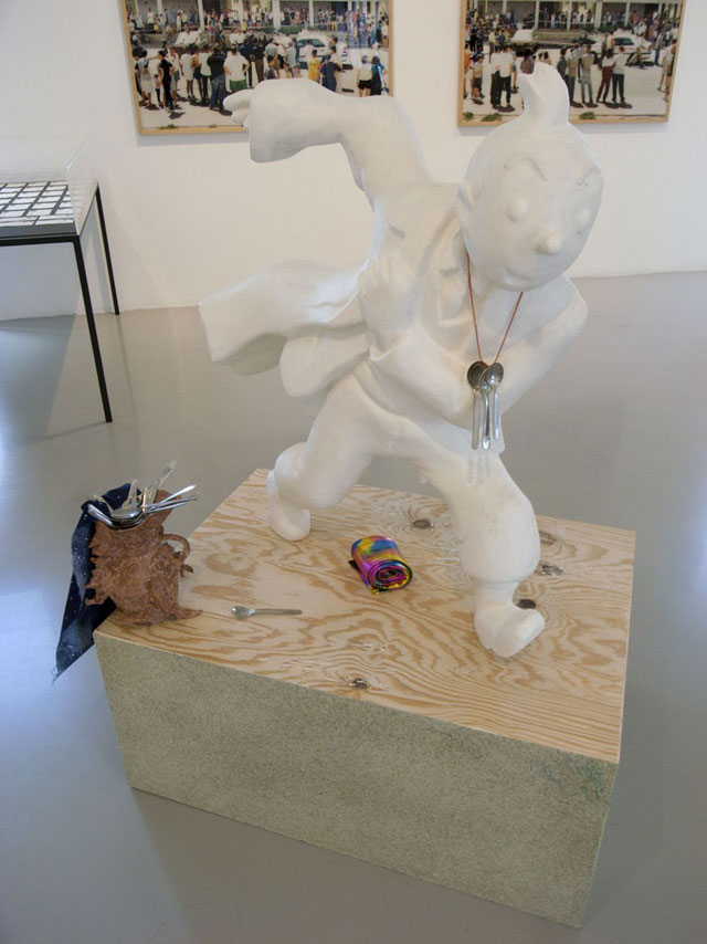
Image © Lewis Ronald
Back to top
Lewis Ronald: You seem to be a happy trader of 20th Century cultural bits, and I see a meeting of physical pointing (airplane spoons) and digital pasting (asterisks and icons). I attach the starting point, so that we know where we are: 3.59pm 31 July 2009 - my camera tells me when i saw your work, i don't know the title however... Helen Marten: The title is 'The advent of a world class economy'. "Trader" is a nice way to phrase it, a good simultaneous binding between something that implies the medieval grubbiness of the mercantile/merchant - of bartering bits for bits - and the high flying gloss of the international market, of dollars, graphic dips, bleeps and waves. It's also something that is very frenetic, never standing still, but always hot-footing between different trends, images or densities. I would probably sit somewhere between the grunge, and the corporate baroqueness... It's funny because we sit with fingertips attached to gorgeously glossy computers, yet things like emoticons, asterisks, serif fonts, ring tones, which are symbols of a more arcane 80's or 90's computer age have come full circle to become rather trendy again. Club posters and car adverts appropriated the most accessible bits from all the design canons and turned them into something crass, so now it's this clunky typography that's beautiful again. Like there is no need for the word "rain" on the cloud graphics of a weather chart, these "old fashioned" things all designate a brutal and definite set of associations. Maybe there is just more allure in exploring what could be seen as the glitches, or a crummy all-thumbs approach... The pointing and pasting in making objects is a symptom of how we live. In a world where everything blurs and bastardises itself, references slip uncontrollably all over the place. So with Tintin, there's an unavoidable zigzagging happening between Boccioni, Chinese ornamentation, classicism, blobby handfuls of Picasso or Paolozzi, via minimalism, cutout cartoons and heraldry... You not only have this infamous euro-centric silhouette, but also this huge piling up of cultural and political histories, of Herge's to and fro-ing between story telling and propagandist journalism, and this amazing implied soundtrack - it's so active, all those 'whacks' and 'oomphs' Herge draws as exclamation marks, swirls and loops, are similarly graphicised into the running figure. And then the airline teaspoons are all engraved with miniature airline logos: kangaroos, faux heraldry, intersecting triangles, it's geometry city! There is a very dense piling up of symbols happening, logocentric travellers, business class, economy and economy all piling on top of one another. This kind of overload is a bit sick making, but there's also a great humour too, a ridiculousness that I like. LR: The Google website offers only a blank box from which to find these things, could you tell me something about your starting points? I'm also interested in you being relatively young and your experience of art school and research in relation to practice. HM: With the internet, you can find, see, uncover almost everything... and once you're inside this giant mesh of information, it is very easy to begin looking at something and find that, in seconds, your direction is totally extrapolated... you might Google-Image something relatively banal like an earthenware bowl, and your search takes this crazy voyage so that several pages down the search you find yourself amongst stone circles, Japanese cuisine and human sacrifice. I think it's this kind of rambling dot-to-dotting, of something that is almost out of control and completely viral, that feeds the things that are buried in and around my work. I'm a big hoarder of words and phrases and I have this ridiculous image bank overflowing with all kinds of junk, but that is also really stringently catalogued. I also usually click straight to Google Images, so make this semi-conscious decision to bypass all the rational indexing, and instead leap to the tangential relationships. In the end, it all filters down to being some kind of cheesy ricochet between all the strains of agitation that are massaged into all the things we're familiar with - everyday things that map out. And I guess your question about art school is similar... everyone is now a publisher, a curator, a producer, a designer... but then tied into that prolificacy is the more clinical aspect of the art world as a 'transnational bureaucracy'. I'm a total baby, but already, I've found that a directory of exchange, or a system of adopting the political, commercial and social sign language of the art world is essential. Being young is advantageous in that you are fresh, new, exciting, whatever, but you're also un-weathered or blanketed. It's an inevitable two-way means of steering. In some places, it perhaps feels less about teaching a craft, than it is about exposing a language, establishing connections and initiating a lifestyle. Even doing business! I was very lucky to have incredible tutors and peers so I was never really thinking of these strategic reactions. But it's very gratuitous because there is a safety - a mental and a financial safeness, really - that you're not massively pushing against until you're on your own. But either way, the process of making is so ridiculous, anyway - one minute you're on the edge of prayer, kowtowing to some fabulous new text or master, and the next, you're running around like an idiot, dodging between a pan of whipped cream and a donkey mask. LR: Your wares sometimes look a bit like biscuits, perhaps gingerbread?!...I'm intrigued by the incorporation of ceramics in your work... HM: Well, they are all made from scratch, these anthropomorphic, cartoons or caricatures that are sometimes formed from graphics and faces. LR: The ceramic material brings it back to something very different; they're unpolished and unfinished, relating to childlike creativity or food art. Their organic and messy construction is at odds with the era of digital graphics. HM: Clay lends itself to that. It's plasticity draws out a more intuitive, touched process. LR: But what's interesting is that you take graphic characters and digital icons, objects from a digital environment, built by 'pen-tools' and vectors... HM: Clay and digitalism are so opposed. It would be like making sculpture in the kitchen...fake sanitised, these white-goods versus the dirt in their shadows... a sneaky fit. There's something about crumbs in computers...imagine an iPhone on a building site... an image related to making clay into something that looks digital. These 'Richard Tuttle spit materials': clay, MDF, polystyrene, as opposed to the steel, aluminium, traditionally weighty materials... LR: Which you use too?... or are they found materials or ready-mades essentially? HM: No, I make everything from scratch... apart from some bits - like the airplane spoons. Everything, like the fittings, chair frames, panels, are made from the beginning, because I really hate just finding stuff and making modifications, there's too much dislocation. The Tintin was carved from polystyrene, and finished with Jesmonite and resin. A polystyrene carver made the first carve and then I did the coating and sanding. It's such an incredible skill - I wouldn't be able to make that. But generally everything is custom made. For instance in the new work all the chair frames are welded, hand constructed. You can find a steel carcass on the street, but I'd find it hard to disguise where it's come from. Even if it's just a mental camouflage. The process of disguising is so different, it's not something I'm involved in. LR: But, if not materially, you do appropriate and camouflage various things; for instance jpegs might be disguised as earthenware. HM: There is a hint of something that has a complete identity, a fixed image - things that already exist or a ripping off of other peoples ideas. But also inverting the processes in which they're made, recombining, or adding new materials, images, notations, systems... You're pulling the strings of what someone else has done, reinventing their urban histories... LR: Perhaps this line of questioning can be a little annoying, but I often want to know why artists actually end up making stuff... HM: While going through the process of making something, you're developing a new mode of touch, or speed, in your studio - it's like learning a new practice and through that, even if you've made a rubbish piece of work, you find a new way of navigating around costs, or materials or images. It's fun... like you said about biscuits, materials have such a physical seductiveness, it's hard not to want to play with them. Materials are vessels. They all have a way of speaking that we recognise - and then it's fun to manipulate them, like using concrete for paint, or exploiting the pattern-making nature of a dripping weld. But a lot of stuff that has been made recently, by our generation of artists, is breaking down to humble, cute gestures. There are a lot of things that get away with looking very nice, very stayed and pretty; these aesthetic, game playing steps, that can be really cute, and conceptual. Maybe 'brown paper art making' is a good way to describe it - lots of photocopies, cardboard, flecks of painted wood - it may be financially symptomatic, that the most accessible way of making work is to use the materials around you. I'm not saying I'm interested in making specifically grand or large scale objects, but there is a boring trendiness in the good-looking gesture. LR: I'm kind of drifting here, but in essence this work is a monument. It's a figure on a plinth, coming down from the long traditional line of sculpture. It also struck me recently how it resembles a trophy... and he's got these spoons around his neck that read a little like a medal. HM: I used to be really interested in this idea of monument. You see so much public sculpture that's located to act as a kind of signifier, a "monument" to something specific, but as a public object you can't decode it. There is the formal element - an abstract lump of steel, or a figure you don't recognise... LR: I was instinctively going to say that public sculpture is very different to monuments, but maybe it's not. Maybe the public sculptures we now see dotted around our paths are the new monuments: we've abstracted them. HM: It's localised art-making that becomes branding. You recognise when a council has squeezed it's budget to erect a wacky bit of stainless steel that's really ugly but also very interesting because it looks like a parody of something you know. There's recognition of what it's trying to be, but it's missed the mark, been steered by a corporate guidebook. LR: Public sculptures have a slippery context: things get built up around them or knocked down, and for one reason or another they seem to change or loose their original significance. HM: What's really interesting is that it's not the placing of them that gives them a meaning, it's their cultural coding: so it's a meeting place or it's a beacon. It's somewhere you eat your lunch, or a fountain, or a space to read, or a place to skateboard. These strains of activity are the things that often rub off on the thing as an object... LR: ...a public consciousness - everyone knows that weird thing and it finds itself a personal significance. HM: Like that blobby sculpture in London Fields [East London] - the farm guardians - made of mosaic and pebbles. It's totally ugly but it really fits there, people sit on it, it's covered in birds and crap. But you can tell it's born out of community mentality. <<<MAYBE WOULD BE NICE TO HAVE AN IMAGE. JESPER ARE YOU BUSY IN THE MORNING?!>>> LR: We're talking about this piece of folk art in relation to its makers. When I saw your piece at the Lisson Gallery I had no idea how old you might be, or where you might be from really... probably the Western world, the piece has references to Europe but I really had little idea... This led me on to guess at your personality. I was noticing the materials used and this sense of a messy, hands-on overload in its construction. I was making this relationship between the way the work looks and what its artist must be like. So I wanted to ask you about how you feel you are read as the person behind the work? HM: I don't think about how my actions in making are going to be read. And I don't imagine the viewer trying to work out where I might be from. But it's interesting in this work where the Tintin character points toward central Europe, but also looks totally Chinese or classical in its figuration. It's white so it's an archaic type of object, and it's a person on a plinth. LR: You like the ambiguity? HM: I like to present something that's not immediately legible. Like a game of Pictionary, you can trace around the image... like drawing a bike, no one can ever quite get drawing a bike right even though its a simple mechanical system; it's difficult to get the total, seamless image. ~ HM: It's funny because at the moment we're going through this push for conscientious green awareness behind everything we do, but at the same time technology is becoming ultra slick, with these lauded Apple gadgets which have revved up our everyday actions with seamless 'apps'. Without them we'd be crapping... having to learn the basics, how to read a map. Instead, we're blindfolded and told "turn left here". LR: You're being critical now! HM: Well, I have to admit that I love these things. I'd be a mess without my computer because it is my system of organisation... LR: But you still manage to make things with your hands, clearly... HM: Yes, and we were talking about the clay, and how it is ultimately a reversal of all these powder-coated, CAD generated processes. LR: Your hammer and sickle piece is a rapid prototype? HM: Yes. It's a symbol that's totally gritty, explicitly related to industry and agriculture, and in that, the sweat and dirt of working, of building and creating something new and totally weighty. LR: But it becomes some sort of architectural fitting? HM: It takes a great weighty symbol and tidies it up in to this little bundle that sits on a wall like a grandiose door handle or rail. But it's made with a process that's born out of all the ideals of revolution, of technological advancement. LR: It's engineered by you as a criticism? HM: It's a celebration and it's a light parody of all those things. It's made with the industry, but also skepticism of the industry. Technology is full of political money, it's not such an innocent creative process. LR: Which is more readable than the work you showed in the Lisson gallery. For instance the colourful metal frame that looked like a dressing screen. HM: That was a reference to George Nelson and his marshmallow sofa. The aluminium panels stand up vertically whilst his sofa is soft and lies horizontally. It has this repetitive and over-engineered construction and looks like it could build upwards forever. There's this flaccid jacket hanging off the bottom, stitched from a Vogue suit jacket design, but made from clear PVC, so really sleazy. I wanted it to function in a way that's pathetically domestic, while being made using this specific corporate language; the brutal language of modernism, straight lines, chrome, block geometries and primary colours. It's slick and sleazy, industry and perverted. The jacket is hung on an over the top, ornate, tropical wood hanger. LR: Which, again, you've made? HM: Yes, that's marquetry. So all these things are bundled up with process, but also their reading is much shinier than their actual construction...'American Psycho' or 'hyper LA'; butch but kitsch, as well. LR: It looks flat-pack, but you engineered it yourself, which is funny because when you see something like that you assume it's some sort of kit that you've changed and presented in a new way. HM: It's interesting that you can end up with a slick object by mistake or you fake it to look like it's been mass-produced, hermetic. I wouldn't say that that is essentially what I'm doing, but it's there to think about. When you're using materials like this they do scream "mass-production", "Ikea", etc. LR: As far as I can tell you don't always give it away that you are actually making these things rather than finding and adapting them. HM: It doesn't matter too much to me. Perhaps it's a pride thing, or an interest. I want to get as much touch in as possible! LR: Are you working like an industrial designer would, could your works be read as prototype? HM: I'd be a terrible designer. I don't make things in a logical way. It's in the fiddling and accidents that I progress an idea. LR: And going back to the "the advent of a world class economy" the construction of the plinth reads a little like freight but is in fact more materially complex... HM: The material is flecked green chipboard like you use in carpet underlay, the top is the grainy ply'. It's crappy industrial everydayness in a more formal context. The figure, too, if broken down is polystyrene; light and crumbly, which fits - it's an ethereal figure, in a running pose, so it's static but also not. LR: Maybe I read it as freight because of the title... HM: That's perfect because it is freight. It's moving, it's linked with the buoyancy of commercial travel, flights and logos, a traveller's economy, money. And also economy in the sense of pairing things down, of spare images, and using a single line to denote a million things. In the process of making, the pace, style and touch of doing it yourself changes what it actually is, and you end up making something different to this 'fixed' plan. LR: I heard Richard Wentworth describe finding himself in corner shops, looking at these weird little plastic objects that refer to historical icons, like models of famous towers, wrist watches and plates with the Royal family on. But the one thing that unified these objects was that on the bottom they had little stickers that said "Made in China". The irony being that none of these things came from China, but rather the western world. HM: It's an old joke that we turn our noses up at the Made in China sticker, but in reality we outsource a lot of stuff there, having abandoned our industrial roots for cheaper, faster and shinier means of production. LR: They can clearly 'assemble' things very well these days. HM: You don't often see Made in the UK! LR: I have some leather bike gloves that are 'Made in UK'...we still wouldn't trust anyone but the Italians or British to construct a good pair of leather gloves! HM: Suits, jams and biscuits! We've latched on to our own cultural cliché. It's funny with the corner shop objects how the highest forms of cultural capital become the lowest bits of kitsch. It keeps on going round and round in circles and is eventually re-appropriated by art or design. Things trickle through irony to become highbrow and serious again. LR: Is that an old system? HM: It's too easy to call it Postmodern, but... LR: I read recently read in an interview John Baldessari 'confess' that all his ideas had actually come from other artists; that he just had to make sure he had adequately disguised those original ideas enough so that no one noticed! HM: I read something similar, that nothing is original, but you shouldn't disguise where those ideas are from, that you should celebrate their starting point, somehow reworking it. I don't think one is more interesting that the other. LR: People continue to redesign the armchair... you seem to be interested in that too? HM : If I'm grumpy I have a habit of looking on eBay for hot furniture. I love chairs... I'd really like to have a collection of interesting chairs. They're such satisfying lumps of engineering. One of my new pieces of work is a riff on a Hans Wegner chair - big looped arms, the tubular steel wings [the Flag Halyard Chair] it's so good looking. LR: How much does it differ from the original? HM: Structurally, it's pretty much identical. But the materials and finish are way more flamboyant and crass. Kind of a party-chair, whereas the original is hard and stern, a solemn modernist object; brutal, pliant, chromed steel. The piece is called 'La-Z-Boy'. LR: There's a lot of work in your show... [Wicked Patterns, T293, Naples, 2009] HM: I was interested in an atmosphere where you're choking on the fussiness, like a force-feeding...a cosmic environment where the material, and pointing narratives are overloaded, rhetorical.. There are so many references slipping over one-another. It's a saturated environment where you can pick out strands of sense. Some of it is obvious whereas elsewhere there is no clear image, there's no physical 'wham!' LR: This is like a beach breaker HM: That's Buren fabric. I mean it's blue and white - you can't not read it as him, so it's a kind of homage. I used to play this game in my head, which I still do...you design a house, and everything in the house has to be made by an artist... in a kind of slapstick way. So Buren makes the toothpaste, Mark Rothko makes the pillowcases, Jacob Epstein does an orange-squeezer, Flavin a grill... LR: Why a domestic environment? HM: It's a displacement, it becomes funny! LR: But when design or technology hits the home it somehow undermines it or changes it. Instead of ethereal and perfect it becomes mundane. Is it degrading the prestige? HM: There's a humour in taking the high art, modernist or whatever, and turning it in to a facile set of speakers or a toaster. LR: Isn't that what generally happens to 'high art'?... HM: I don't know. It's funny, though. |
|---|
Helen Marten lives and works in London, UK.
Lewis Ronald is an artist based in London, UK.
'The advent of a world class economy' (2009)
Image © Lewis Ronald
Back to top